Getting started with visualizations
Visualizations provide a unique way of looking at the data generated by specific recipes. A visualization could be a complex image that you can zoom in and out of to examine connections between nodes or it could be as simple as a text-based table that you can filter or search (see the examples section to see what these look like).
In this guide, we will explain everything you need to know to find, use, and create visualizations in the Moderne Platform.
Where visualizations exist
While you will see a visualization button on every recipe run, it will be disabled for most recipes.
This is because only a handful of recipes currently offer visualizations. You can see the list of visualizations in the moderne-visualizations-misc repository or you can use the following GraphQL query to find all visualizations:
query {
  visualizationCategories {
    visualizations {
      id
      name
      description
      recipe {
        id
      }
    }
  }
}
Below you can find some of the most popular recipes that currently produce visualizations:
org.openrewrite.sql.FindSql
org.openrewrite.java.dependencies.DependencyVulnerabilityCheck
org.openrewrite.cobol.search.FindRelationships
org.openrewrite.gradle.search.FindGradleWrapper
org.openrewrite.cobol.search.FindCopybook
org.openrewrite.cobol.search.FindRelationships
org.openrewrite.FindSourceFiles
org.openrewrite.LanguageComposition
org.openrewrite.FindLstProvenance
org.openrewrite.LanguageComposition
org.openrewrite.java.search.FindMethods
io.moderne.prethink.UpdatePrethinkContextNoAiStarter
How to view visualizations
If a recipe produces a visualization, you can find them in the Visualizations tab:
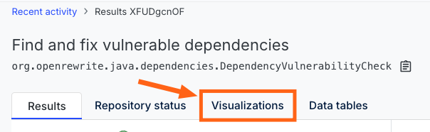
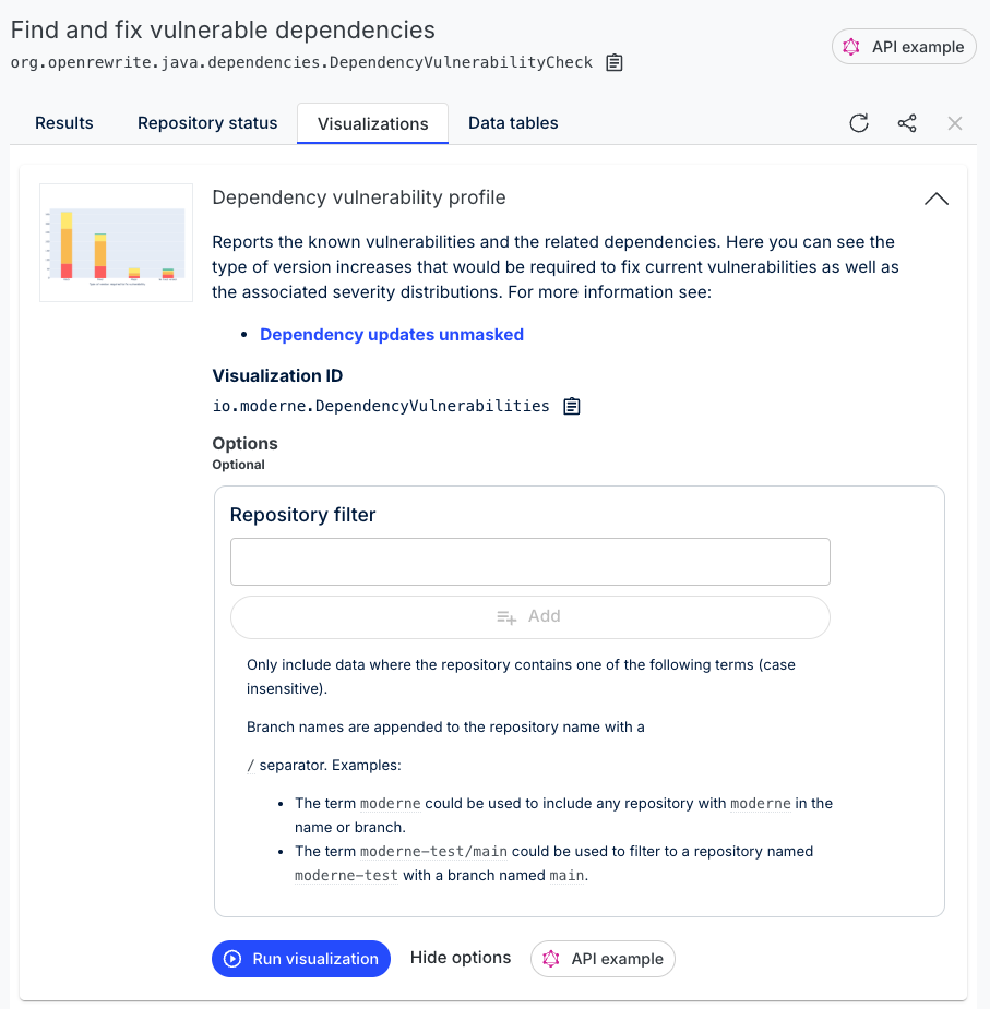
The visualizations page will often include multiple visualizations. Find the one you want to run and, if it has options to fill out, fill them in as needed.
Visualization options serve two main purposes: they can change the rendering of the visualization (such as turning a node from a square to a circle) or they can subset the data (e.g., taking 1000 nodes and filtering them down to 100 that match your specific needs).
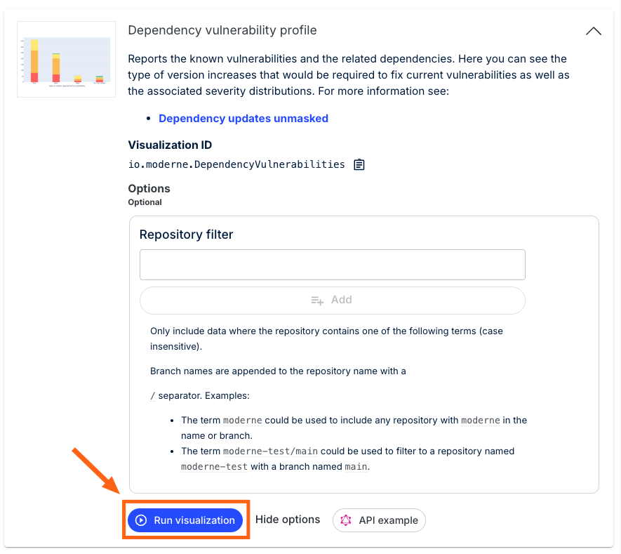
Once you've selected the options you want, click the Run Visualization button at the bottom:
This will trigger the process for building the visualization. Once it's done building, you should see a visualization appear:

How to create visualizations
Please see our how to create visualizations guide.
Visualization examples
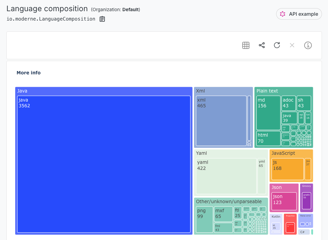
Language composition report
This reports the usage of different programming languages and data file formats. Can be configured to count lines of text or number of files.
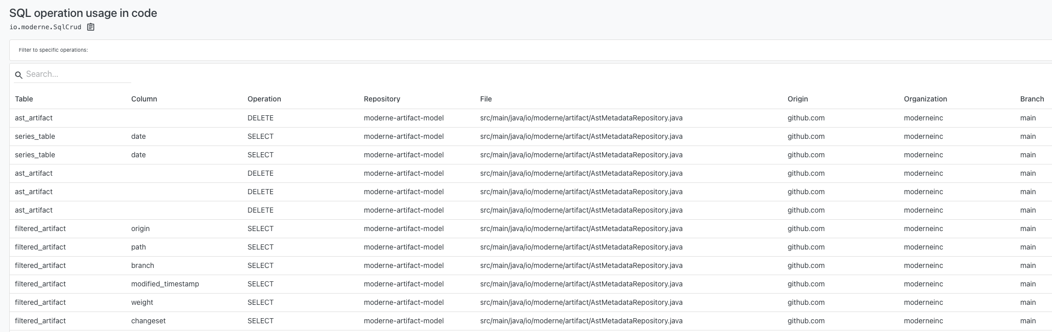
SQL operation usage in code
Reports SQL operation usage. A good way to understand the SQL usage patterns and identify programs which interact with a database.
Dependency vulnerability profile
Reports the known vulnerabilities and the related dependencies, broken down by the severity of the vulnerability. Notes whether a major, minor, or patch version increase would be sufficient to move the affected dependency to a version known to have a fix for the vulnerability.
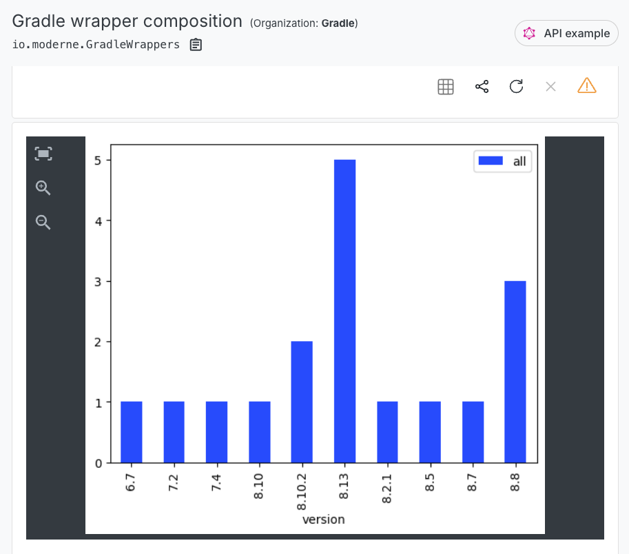
Gradle wrapper composition
Reports the distribution of Gradle wrapper versions in use. Useful when planning migrations and upgrades.
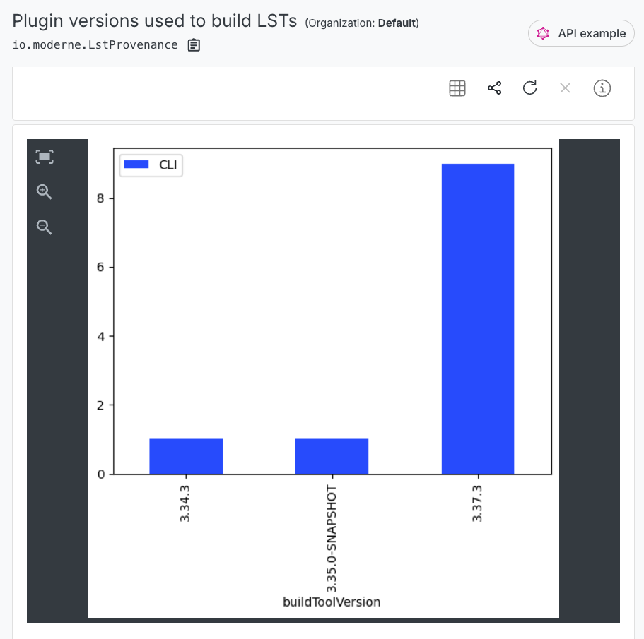
Plugin versions used to build LSTs
Reports the tool which produced the LST and the version of that tool. Useful for evaluating whether or not you can expect to see the latest features and bug fixes in action.
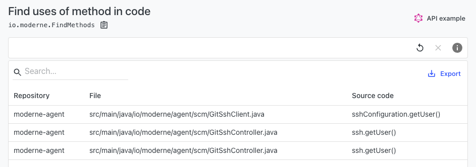
Find uses of method in code
Reports method invocations. Useful for finding example usage or conducting impact analysis for proposed changes.
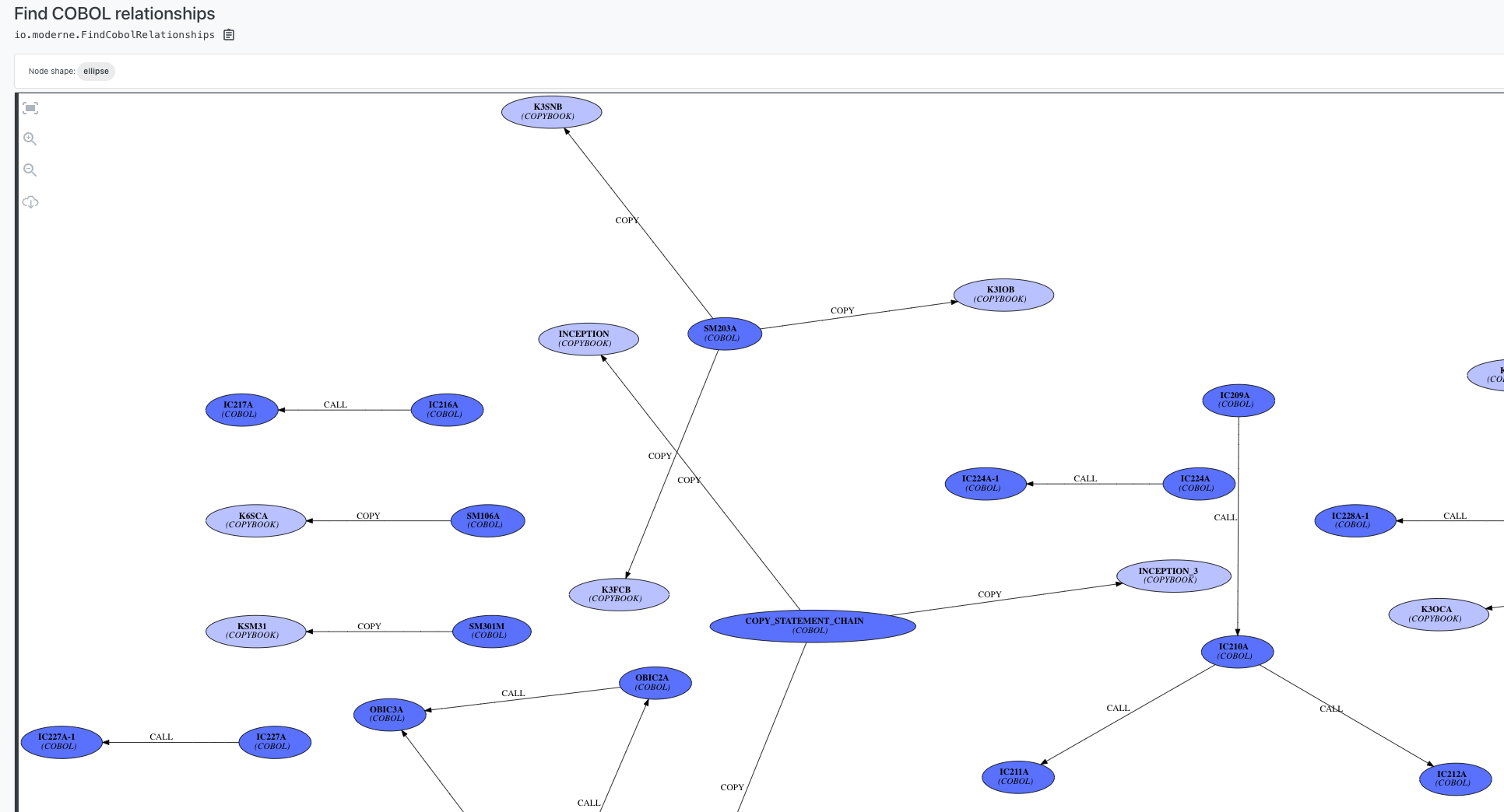
COBOL relationship diagram
Reports the relationships between different COBOL resources. Includes COBOL sources, Copybooks, Link-edit cards, DB2 access, and others.
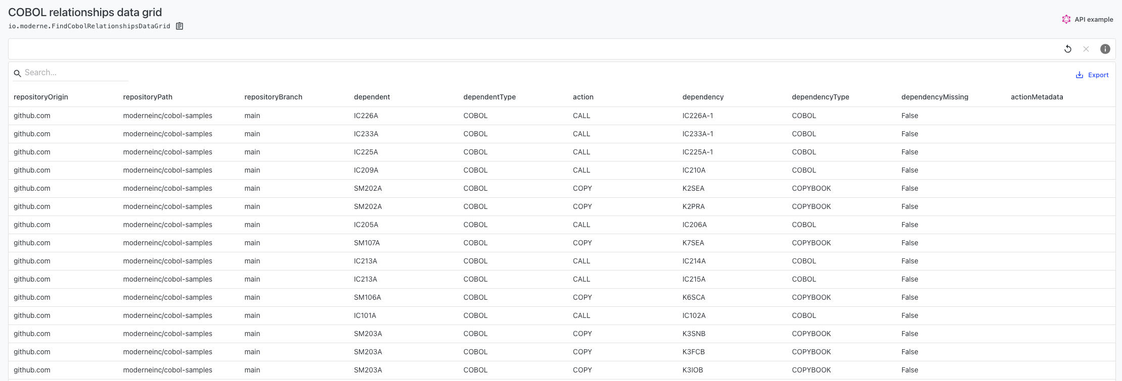
COBOL relationship data grid
Reports the relationships between different COBOL resources. Includes COBOL sources, Copybooks, Link-edit cards, DB2 access, and others.
Prethink code quality visualizations
Moderne Prethink recipes produce a suite of code quality visualizations that help you understand the health and structure of your codebase. All of the following visualizations are generated by running the Update Prethink context (no AI) recipe:
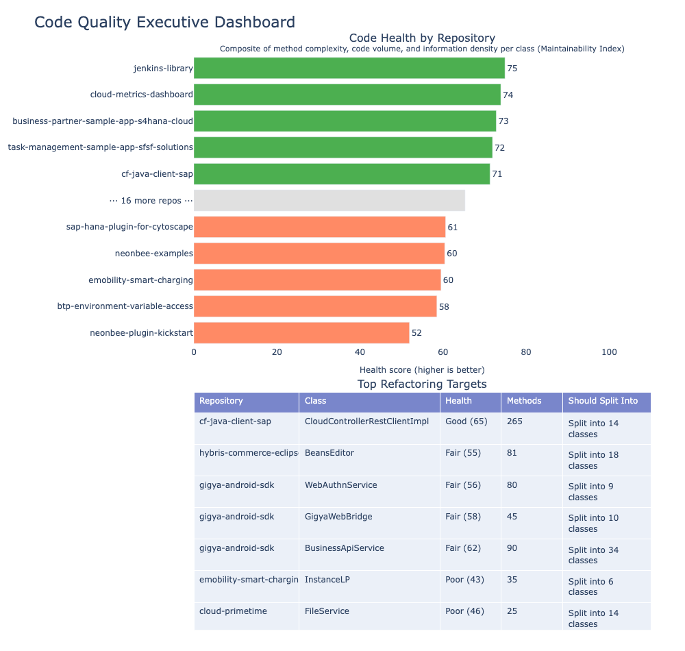
Code quality executive dashboard
A single-page executive summary combining all quality data tables. Shows portfolio health score, top riskiest repositories, smell severity breakdown, and top refactoring targets. Designed for engineering leadership.
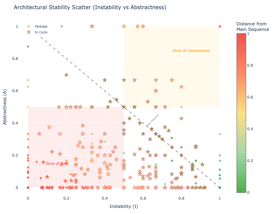
Package stability vs abstractness
Martin's Main Sequence diagram plotting packages by instability and abstractness. Helps you identify packages in the Zone of Pain (high stability, low abstractness) and Zone of Uselessness (low stability, high abstractness).
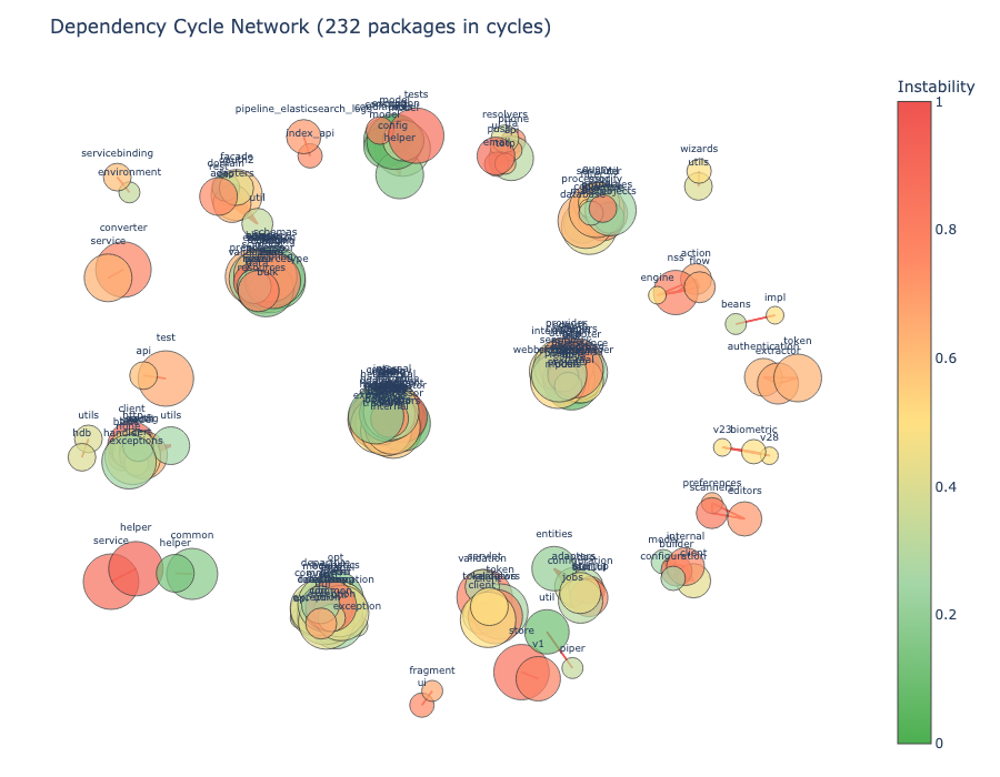
Package dependency cycle graph
An interactive network graph showing packages involved in dependency cycles. You can hover to highlight all packages in the same cycle. Color indicates instability.
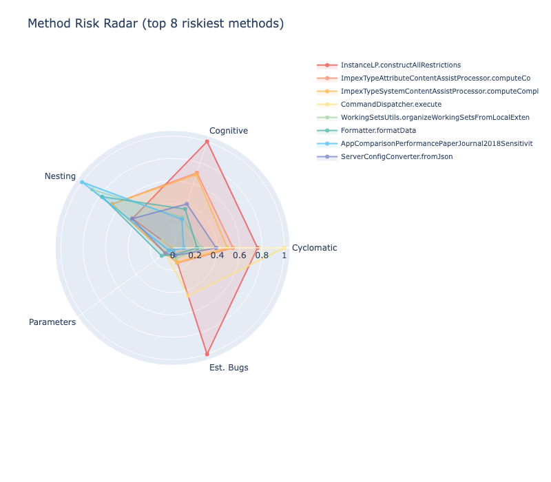
Method risk radar profiles
A radar chart overlaying the top riskiest methods across five quality dimensions: cyclomatic complexity, cognitive complexity, estimated bugs, nesting depth, and parameter count.
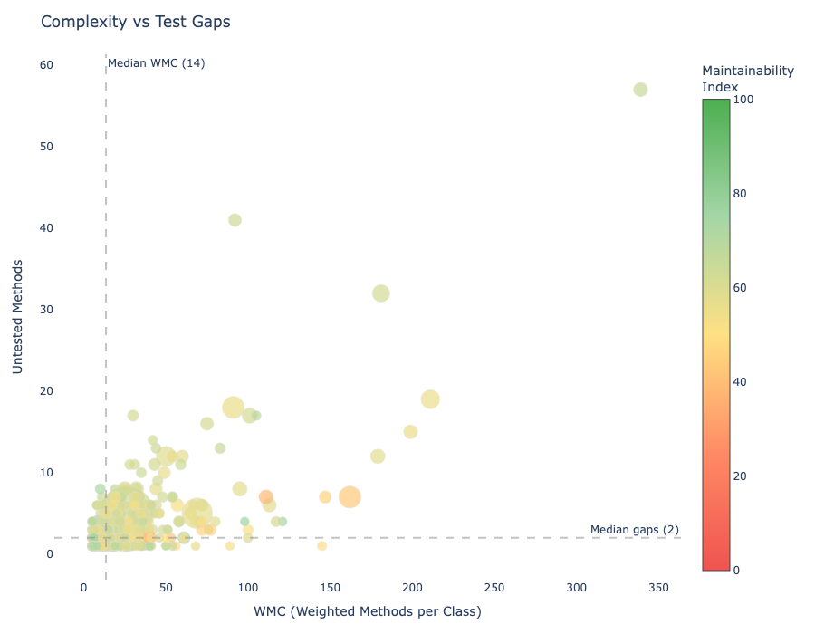
Complexity vs test coverage risk
A bubble chart joining class complexity with test gaps. The x-axis shows weighted methods per class, the y-axis shows untested method count, and color indicates the maintainability index.
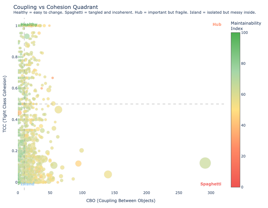
Class coupling vs cohesion risk matrix
A scatter plot with four quadrants classifying classes by coupling and cohesion: spaghetti, hub, island, and healthy.
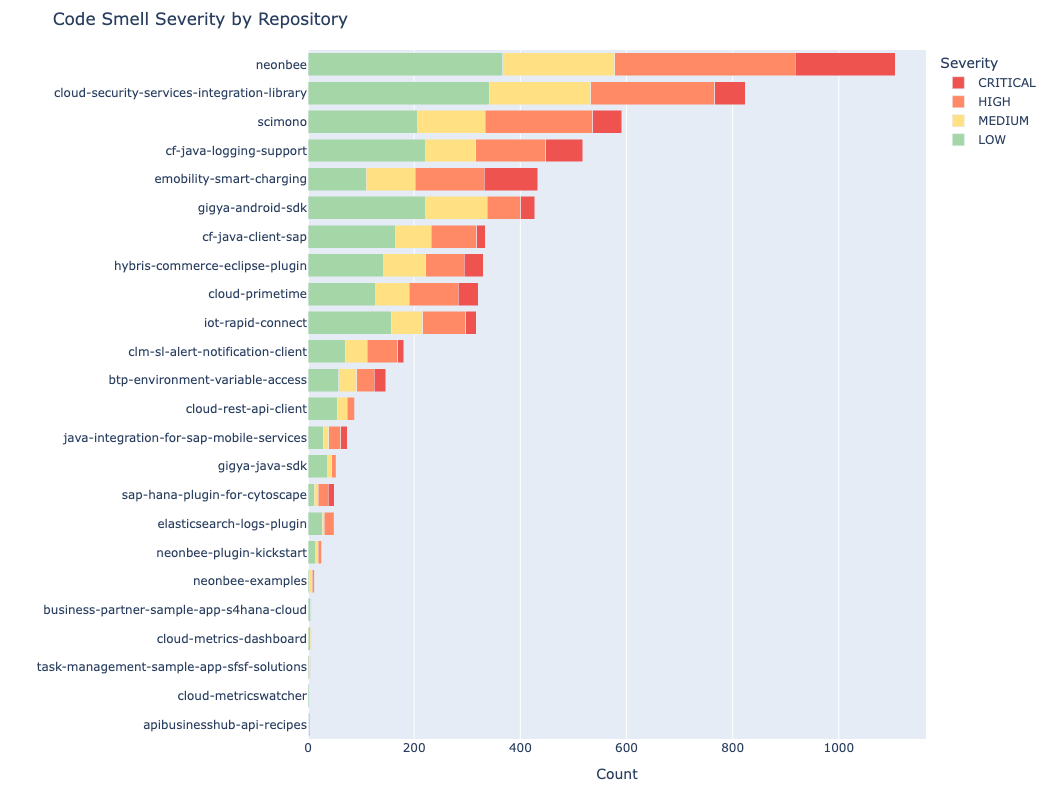
Code smell distribution by repository
A horizontal stacked bar chart showing code smell counts per repository, segmented by severity (critical, high, medium, low).